HomeTutorialsHand PaintedTablescapes

Saturday, May 12, 2012

Wired Garden Cloche

I am sure many of you have seen the wire cloches that are so popular now.  I have had one for a couple of years that I put over a large pot and I use it like a terrarium cover.  I love the look of the wire with my plants, but the sizes are never very large when I find them.  So I decided to make my own with a wire lampshade form I have had knocking around here for a while. 
 I used 1/2 inch poultry wire and cut the piece to fit all the way around the form.  Then I cut a circle to clamp over the top.  I purchased an inexpensive finial and used a bolt to attach it up through the shade.
 Then I sprayed it with gray primer paint.  When that was dry, I took a small paint brush and some ivory paint and dry brushed the ivory to spot lighten the cloche.
 Here I have it sitting over a pot of ivy with a cherub.
 This was a pretty good sized shade so it made a nice size cloche.  You can cut the poultry wire with wire cutters and then clamp it down with long needle nose pliers.
Pin It

I'm partying at...


Mondays          The House in the Roses       Le Chateau des Fleurs        The Graphics Fairy
                                      Metamorphosis Monday
Tuesdays          Knick of Time       Tutus and Tea Parties       Coastal Charm  
                                      Boogie Board Cottage   
Wednesdays     Savvy Southern Style         Ivy and Elephants        Faded Charm Cottage            
                                     Fine Craft Guild      
Thursdays        Embracing Change     The Shabby Creek Cottage    No Minimalist Here 
                                     Tablescape Thursday   Delightfully Inspiring Thursdays
Fridays            French Country Cottage       My Romantic Home        Miss Mustard Seed
                                    At the Picket Fence     Potpourri Friday     Common Ground
                                    The Charm of Home    Decorating Insanity
Saturdays        Funky Junk Interiors

Sundays           It's Overflowing

Friday, May 11, 2012

French Buffet

For this week's furniture piece, I wanted to share a project my fellow dealer brought in last week.  I wish I had somewhere to put this because I love it.  I love everything about it, the moldings, the lines, the appliques and the knobs.  Oh, the color too.  Elaine is very talented and she does a very professional job on her furniture re-dos. 
 The paint job on this is flawless, a look I can never achieve so I always end up with a very shabby look.  I know it's a matter of style, but Elaine really does a wonderful job.  I am so glad she let me photograph it to share with you.  She was such a good sport, she even helped me move a whole dining room set out of the way so I could take the pictures.  Of course, this piece is available at our shop.  So if you are anywhere near, drop in and take a look.
Pin It

I'm partying at...


Mondays          The House in the Roses       Le Chateau des Fleurs        The Graphics Fairy
                                      Metamorphosis Monday
Tuesdays          Knick of Time       Tutus and Tea Parties       Coastal Charm  
                                      Boogie Board Cottage   
Wednesdays     Savvy Southern Style         Ivy and Elephants        Faded Charm Cottage            
                                     Fine Craft Guild      
Thursdays        Embracing Change     The Shabby Creek Cottage    No Minimalist Here 
                                     Tablescape Thursday   Delightfully Inspiring Thursdays
Fridays            French Country Cottage       My Romantic Home        Miss Mustard Seed
                                    At the Picket Fence     Potpourri Friday     Common Ground
                                    The Charm of Home    Decorating Insanity
Saturdays        Funky Junk Interiors

Sundays           It's Overflowing

Thursday, May 10, 2012

Book Review Part 1

Last weekend I went to a local flea market with my friend and I found this book at one of the vendor's stalls.  I absolutely love the design and artistry of this book.  It is called Decorative Designs by Graham Rust.  If you love old book plates and scenic pictures, you will love this book.  The copyright on the paperback I bought says 1999.  I went on line and found several copies on Alibris.com and Amazon.  This man is an incredible artist.  My photos don't do his work justice, but the book is filled with amazing artwork and decorating ideas.  In fact, it had so many ideas, I am doing this post in two parts:  neutrals and colors.  There are hundreds of pics and ideas that he shares.  If you enjoy looking at these photos, you will want to get a copy of this book.  His style is very French which I know many of you love as much as I do.  The price for a used paperback was under $10.

Cover of the book.

Bookplate from page 140

Bookplate from page 139

Christmas card from page 127

Bookplate designed for Lord King of Wartnaby from page 139

Bookplate designed for Her Majesty the Queen from page 138

Bookplate designed for Her Majesty the Queen from page 138


Print from a collection of plates he designed from page 170

Book cover from page 130


I'm partying at...


Mondays          The House in the Roses       Le Chateau des Fleurs        The Graphics Fairy
                                      Metamorphosis Monday
Tuesdays          Knick of Time       Tutus and Tea Parties       Coastal Charm  
                                      Boogie Board Cottage   
Wednesdays     Savvy Southern Style         Ivy and Elephants        Faded Charm Cottage            
                                     Fine Craft Guild      
Thursdays        Embracing Change     The Shabby Creek Cottage    No Minimalist Here 
                                     Tablescape Thursday   Delightfully Inspiring Thursdays
Fridays            French Country Cottage       My Romantic Home        Miss Mustard Seed
                                    At the Picket Fence     Potpourri Friday     Common Ground
                                    The Charm of Home    Decorating Insanity
Saturdays        Funky Junk Interiors

Sundays           It's Overflowing

Wednesday, May 9, 2012

A Day in the Life of a Sock Monkey

My name is Jacques.  I am a vintage sock monkey.  I flew in from Paris a couple of weeks ago and there was so much turbulence I dislocated both of my shoulders.  
 My guardian angels were watching over me when they dropped me in Little Miss Maggie's care.  She surgically repaired my shoulders.
 Now I get to lay in bed for hours reading the latest sock monkey adventures.
 She put me up in the bridal suite and I do have to share it with the honeymooners.
 I get up around noon and play by the seashore (well sort of).
 I do have to put up with a lot of cats though.
 Darn, they are all over the place.
 In the afternoon I enjoy the symphony.
 I hope I never have to fly anywhere ever again.
Boy, what an exhausting day.  I think I'll have my milk and cookies now.   That cat better not try to steal them from me.  I have it pretty good here.  I think I'll stay for a while longer.  Au revoir.
Pin It

I'm partying at...


Mondays          The House in the Roses       Le Chateau des Fleurs        The Graphics Fairy
                                      Metamorphosis Monday
Tuesdays          Knick of Time       Tutus and Tea Parties       Coastal Charm  
                                      Boogie Board Cottage   
Wednesdays     Savvy Southern Style         Ivy and Elephants        Faded Charm Cottage            
                                     Fine Craft Guild      
Thursdays        Embracing Change     The Shabby Creek Cottage    No Minimalist Here 
                                     Tablescape Thursday   Delightfully Inspiring Thursdays
Fridays            French Country Cottage       My Romantic Home        Miss Mustard Seed
                                    At the Picket Fence     Potpourri Friday     Common Ground
                                    The Charm of Home    Decorating Insanity
Saturdays        Funky Junk Interiors

Sundays           It's Overflowing

Tuesday, May 8, 2012

French Menu Boards

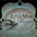
My inspiration for these two bistro signs came from a French sidewalk cafe we visited in Charleston, South Carolina.  I love menu boards and went back after hours and photographed all the signs.  As with my two previous French cafe signs, I purchased my cabinet doors at the salvage yard click here for complete tutorial.  I pay very little for the actual materials to make these signs, but I make up for it in the amount of time I put into designing and lettering each piece.  If you want to duplicate this look, be prepared to put in some sweat equity and patience, and I promise you will be happy with the end result.

You can find the French wreaths at Bella Cottage click here.  I just went to their website, which was recently redesigned and I am not familiar with where they put the applique section, but there is a phone number to call.

This is how the cabinet doors started.

I painted them with a paint I had color matched to the Rustoleum Ivory Silk color.  I didn't want to spray paint these.  I wanted them brushed.  Much more economical.

I lettered with black acrylic craft paint and shaded with gold rub n' buff applied with a liner brush.  For the rest of the directions, refer to my above link for the staining and aging of these signs.  Make them look as new or as old as you like.  Thanks for stopping by.  I hope you will find some inspiration here to create your own magnificent signs.
Pin It

I'm partying at...


Mondays          The House in the Roses       Le Chateau des Fleurs        The Graphics Fairy
                                      Metamorphosis Monday
Tuesdays          Knick of Time       Tutus and Tea Parties       Coastal Charm  
                                      Boogie Board Cottage   
Wednesdays     Savvy Southern Style           Primp         Faded Charm Cottage            
                                     Fine Craft Guild      Ivy and Elephants
Thursdays        Embracing Change     The Shabby Creek Cottage    No Minimalist Here 
                                     Tablescape Thursday   Delightfully Inspiring Thursdays   
                                    Have a Daily Cup From Mrs. Olson
Fridays            French Country Cottage       My Romantic Home        Miss Mustard Seed
                                    At the Picket Fence     Potpourri Friday     Common Ground
                                    The Charm of Home    Decorating Insanity
Saturdays        Funky Junk Interiors

Sundays           It's Overflowing

Monday, May 7, 2012

Little Black Box

For today's project I chose a French typography label from the Graphics Fairy.  I found this box at the flea market a while back.  It was painted orange inside and out.  You can still see a tiny bit of chipping on the front of the box exposing a little bit of the original color.  Since I wanted the box to have an aged appearance, that doesn't bother me at all.

First I printed the label in an 8x10 size.  I took my barbecue lighter and singed the edges to make it look torn.  Next step is to spray it with 3M Super 77 spray adhesive.  Then I took the instant coffee crystals and just sprinkled them in a controlled manner where I wanted staining.  I even got a drip mark and I left it alone.  When I started blotting up the coffee (gently blot and do not wipe away harshly) some of the coffee stained the label in a nice random manner and made it look like it's really an old label.  I happen to use an ink jet printer so just to be sure the dye in the label was set, I sprayed the whole label with Krylon Crystal Clear to set the dye.  It also sets the coffee stain in permanently as well.

I was pleased with the label making process thus far, but I thought the box needed a little more detail.  I reinstalled the hardware I had removed for painting and then pulled out a few of my basic stencils.  I didn't have as much room on the box lid as the label had, but I gave the lettering a similar pattern as the label I was trying to imitate.  When the lettering was complete, I went in with some stain and tried to copy the coffee stain pattern.  When complete, the box received a spray of clear sealer spray to seal everything.  Now I have a great box that has a wonderful new personality.
Pin It

I'm partying at...


Mondays          The House in the Roses       Le Chateau des Fleurs        The Graphics Fairy
                                      Metamorphosis Monday
Tuesdays          Knick of Time       Tutus and Tea Parties       Coastal Charm  
                                      Boogie Board Cottage   
Wednesdays     Savvy Southern Style           Primp         Faded Charm Cottage            
                                     Fine Craft Guild      Ivy and Elephants
Thursdays        Embracing Change     The Shabby Creek Cottage    No Minimalist Here 
                                     Tablescape Thursday   Delightfully Inspiring Thursdays
Fridays            French Country Cottage       My Romantic Home        Miss Mustard Seed
                                    At the Picket Fence     Potpourri Friday     Common Ground
                                    The Charm of Home    Decorating Insanity
Saturdays        Funky Junk Interiors

Sundays           It's Overflowing

Sunday, May 6, 2012

Summertime Chintz

Once again, I set out to do a very neutral tablescape, but look what happened.  I fell in love with the purples and greens.  This purple stock is heavenly.  I paired it with some green snowballs and a few lilacs and I was in love.  I couldn't find any white flowers so I cut some stems off our white icebergs which are not usually a cutting flower, but it worked great.


The china is chintz and the pattern is called Summertime.  Believe it or not, we use this china for Thanksgiving.  It looks amazing with all the fall colors.
I don't know what it is about these flowers, but I was just enamored with them. 

Here is a close up of the lamp base.  It has the same colors as the flowers.  I found these lamps at a yard sale years ago.  I believe them to be from the 40's.  They have little fish feet and I love the patina of the gold lamp base.  It's darkened with age.  The shades I found at another sale.  They are silk and the colors went perfectly.  I don't have any purple anywhere else in the house, but these seem to blend nicely because the colors are subtle.
I went through a "fruit" phase a few years ago and I loved anything with fruit like old tole trays, china, Christmas ornaments.  I never really got over it, but I have toned it down a little.
Here is a close up of the canvas print with the girl.  I don't know the title of this particular piece but she fits right in with my decor.  She has a very romantic appeal about her.  

Hope you are all having a wonderful weekend.  It was nice of you to visit,

Pin It

I'm partying at...


Mondays          The House in the Roses       Le Chateau des Fleurs        The Graphics Fairy
                                      Metamorphosis Monday
Tuesdays          Knick of Time       Tutus and Tea Parties       Coastal Charm  
                                      Boogie Board Cottage   
Wednesdays     Savvy Southern Style           Primp         Faded Charm Cottage            
                                     Fine Craft Guild      Ivy and Elephants
Thursdays        Embracing Change     The Shabby Creek Cottage    No Minimalist Here 
                                     Tablescape Thursday   Delightfully Inspiring Thursdays
Fridays            French Country Cottage       My Romantic Home        Miss Mustard Seed
                                    At the Picket Fence     Potpourri Friday     Common Ground
                                    The Charm of Home    Decorating Insanity
Saturdays        Funky Junk Interiors

Sundays           It's Overflowing